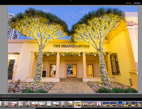
Today we are going to show you how to add some style to your photographs
This subject could be several books in total, but for today we’ll show you a few tips that can add some interest right away.
Shoot from interesting perspectives
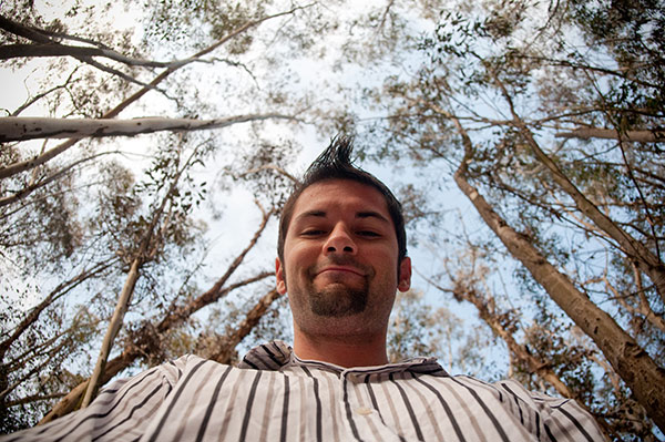
I would argue that 99% of photos most viewers ever see are shot from eye level while standing – the same level they see 99% of their entire life. It’s no surprise when you go to the top of a huge building and look down at a city that it’s visually stunning because we don’t see that very often. Anytime you are afforded a unique viewpoint it’s always interesting.
If you just got down super low (I’ve been known to lay stomach down in the street to get a different angle) or got up high shooting downward you would give the viewers something they usually never see. Shooting straight down from bird’s eye view or shooting straight up from a bugs eye view can also create an entirely new and interesting perspective.
Get down low
Get high up
One of my favorite examples of this was in New York Magazine’s Grub Street site. They rounded up 107 of the best cocktails in the city and organized them by color.
The best part about it is when they are shot from above the drinks become quite beautiful and take on an entirely different personality. My hat goes off to the photographer who thought of this and executed it so perfectly.
Always aim for symmetry
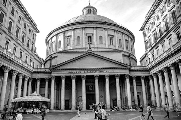
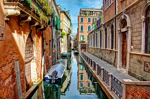
I can’t tell you how important this is! On the symmetry side: always be on the lookout for a perfect balance of symmetry in a photo. Your viewer will do backflips if you can find an image that perfectly reflects the same thing top to bottom, or right to left!
Stanley Kubric understood this perfectly. Watch the short video below to see how he did it in all of his movies:
Kubrick // One-Point Perspective from kogonada on Vimeo.
I did this in a bunch of photos from a trip to Italy. It was a fun challenge to see how much symmetry I could capture in that country.
Declutter the background
Nothing is more distracting that a cluttered background in a photograph. Pay just as much attention to your background as you do to your subject and foreground. You can do this a few ways:
Actually find a background that is simple
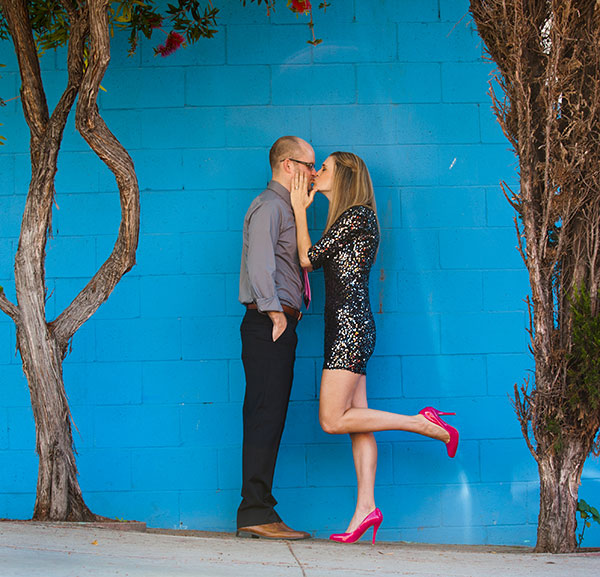
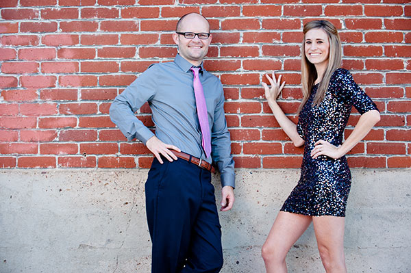
I was on a shoot with a couple and we were doing portraits of them together. I was in the middle of a busy city area with a lot of visual distraction. I found a solid blue wall that served well as a simple background so the focus of the image could be the couple.
I also found a simple brick and concrete wall a block away that served as a great backdrop.
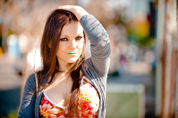
Defocus your background using a big aperture
One thing you can do to de-clutter your background is to use a bigger aperture so the background becomes blurred nicely.
That’s it for today class.
During tomorrows class we are going to explore some basic photo editing in my favorite editing software: Lightroom.

