Have you ever taken a photo that just doesn’t look quite right? The subject is amazing so why isn’t your final shot amazing too?
Often the answer is composition. Stop and read a few photo critiques and you will almost always see compliments, tips or out-right criticisms of the shots composition, it really is that crucial, so compose your photo carefully.
Knowing where to position your subject in your shot (composition) is one the basic building blocks to a great photo. Sure, knowing all the settings and techniques matter too, but composition is key.
Scientists have worked out a few simple rules (although I prefer the term guidelines) you can use to instantly improve your images. In this article I’ll give you a jargon-free introduction on where to position subjects in your frame and throw in a few tips along the way.
1. Rule of thirds in composition.
Imagine your shot is divided into thirds both horizontally and vertically to make a grid. I use picture mounts marked out with thread when I’m demonstrating it. Its low tech but a great inexpensive way to practice framing without having to wave a camera around.
A lot of cameras can be set to show a grid overlaid in the viewfinder to help.
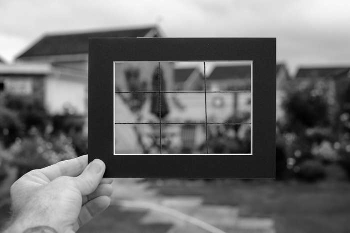
By positioning features and subjects on these lines you get a more pleasing image. For maximum effect you can position the main feature on a cross over (intersection) point. Let me show you what I mean…
The following photo is a simple shot of the moon with a bird silhouette for extra interest. The detail and content is good but the shot lacks impact and is a bit ‘so what’.
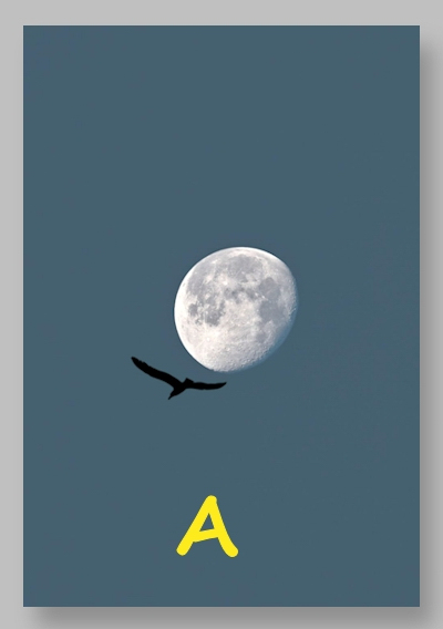
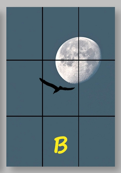
If I overlay the rule of thirds grid, I can position the moon on the intersection of lines and position the bird in the central box and then crop.
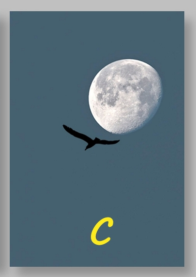
The final image grabs the viewer’s attention, it has impact and is good to look at, yet the only thing I have changed is the position of the subjects in the frame. The rule of thirds works and is probably the most common and most useful composition rule.
Top tip:
Shoot wide and crop later. It can be tricky to get your shot perfectly aligned in camera so go for the general areas then you can tidy things up with a crop later.
#2 Leading lines in composition
Stop for a moment and look out the window: the world is full of lines, straight hedges, paths, wires, roads, flowerbeds, patterns in fabrics, planks in a table, the list goes on and on.
The great thing about including these in your photo is that our eyes naturally follow lines. This means that a line in your photo can lead your viewer’s eyes along it to your subject since they act as leading lines.

#3 Rule of odds in composition
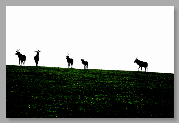
Group three, five or seven subjects to get a visually attractive photo, our brains really are happier with odd numbers.
Too many subjects in a picture can make it look crowded. Too few and the photograph may look incomplete.
If you must use even numbers try to get a balanced symmetrical shot.
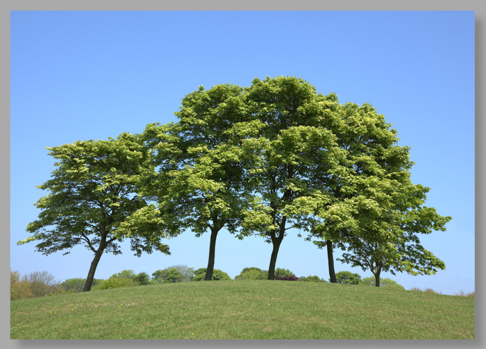
The shot above shows a very convenient group of five trees. The lower shot however had six animals in it so removing one when I got home was necessary to keep to the rules.
Top tip:
It is okay to cheat and physically move things in or out of your shot.
# 4 Space to move into.
When you have a great subject the temptation is to zoom in and fill the frame. While this can be a great idea, it isn’t always the best choice.
Purposely leaving space around your subject can help tell the story behind the shot.
If you want to show that your subject is moving, leave space to travel into so it shows where they have come from.
An elephant walking is far more interesting than one frozen in time.
Compare these two shots below. They are the same image cropped differently. The second shot with space to move into is by far the better of the two.


Top tip:
It’s not just physical things that need space to move into. Allow room for people’s gaze to travel too.
5. Strong diagonals in composition
Diagonal lines just about always add strength to a shot. If two lines cross or converge you’ll also add interest where they meet or lead towards.
Use them to pull the eye into the frame, add a structural feel to the shot, or even bring simplicity to a background.

Top tip:
Beware of diagonals in portraits. Hard straight body parts can look posed, awkward, and downright painful.
6. Simplicity is key in great composition
We started off difficult, so now we can end easily. Simplicity can make for a great composition.
At one end of the scale you need to avoid distractions in the background. At the other you can shoot a completely plain background with just a single element to it and both will look good.
Think about what you want to shoot then isolate it from anything irrelevant. This is an easy rule to follow but one that, when you do it well, will give you great results.
This is true regardless of if you’re shooting a single pea or your sister’s family.

Finishing off
I think these are the absolute ‘must know’ composition rules to get you started. There are plenty more and the experienced photographer might now be stuttering and grumbling over an omission, but we have to start somewhere.
The important thing to remember is that these rules are more like guidelines. Photography should be fun and your shots should capture something important to you.
Good photos may just happen by chance but usually they are created, so take your time to stop, look, and plan before you raise your camera.
Want more helpful photography tips?
Check out the Hacking Photography ebook set. With 71 pages of no-fluff tips and tutorials, its an excellent beginners guide to take great photos in only a few days.


Cameron, You are so right about compositional elements in a photo. There is something magical about finding that balance in a photo between composition and content. It can be subtle but it is there.
Thanks for the feedback Jane.
it is always good to know the rules and then creatively break them when necessary
Breaking rules is always fun Conrad :)
I know you’ve termed them ‘guidelines’ but I always like the phrase, ‘tools, not rules’ for things like this. Good advice.
I can see how using those tips can really improve my photos! Seems simple just got to remember.